Introduction
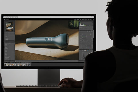
Creating a beautiful render doesn’t end in your rendering software. While the engine does a fantastic job of simulating realistic materials and lighting, the real magic often happens in post-production. For us, Lightroom is an essential part of the workflow—allowing us to refine, balance, and bring our renders to life with subtlety and control.
Every rendered image you see on our website and social media is edited. Some it might be the smallest amount of sharping to bring out a wood texture, others more drastic stylistic shifts.
In this blog, we’ll walk through how we prepare our images in KeyShot, the export settings we use for flexibility, and how we leverage Lightroom to elevate the final result. Whether you're new to post-processing or refining your own workflow, this breakdown offers a look into how we achieve clean, realistic visuals.
1. Before & After: The Power of Post-Processing
Before diving into the technical details of our workflow, it’s important to see the real impact of editing on renders. Comparing the unedited KeyShot output with the final Lightroom-enhanced image gives you a clear sense of why post-processing is a crucial step—not just a finishing touch.
These side-by-side comparisons reveal how thoughtful adjustments to exposure, colour balance, texture, and detail can transform a render from good to great. It also illustrates why we keep our KeyShot settings relatively flat—preserving the flexibility needed for precise editing in Lightroom.
Scroll down to view the transformations, and then we’ll break down each part of the process that gets us from raw render to polished image.

In some cases, we also turn to Photoshop for final touch-ups or creative enhancements that are difficult to achieve natively in KeyShot or Lightroom.
For example, in this projector render, we used Photoshop to add volumetric light beams emanating from the projector lens. While KeyShot can simulate lighting effects using scattering mediums, achieving a realistic beam of light can become heavy on the scene and requires additional control over blending modes, opacity, and layering; something Photoshop handles with ease.

This kind of enhancement helps push the realism and storytelling of a render further, especially when conveying atmosphere or subtle visual effects. While we aim to do as much as possible in KeyShot and Lightroom, Photoshop gives us the flexibility to add those final flourishes that complete the image.
2. Image Style in KeyShot
Our typical workflow starts in the Image Style tab in KeyShot. We always render in Photographic Mode, which gives us access to the Response Curves. These modes translate the raw data from the rendering engine into a regular RBG image that we see on screen. ACES is known for having the best colour translation, but on older versions of KeyShot (before they integrated ACES), you can use Low Contrast.
From there, we manually fine-tune the exposure, white balance, and contrast to balance highlights and shadows and adjust the overall scene temperature. These changes help bring the lighting closer to real-world conditions without over-processing.
We keep our use of curves to a minimum and often apply a slight desaturation combined with a modest boost in vibrancy. This helps tone down overly saturated areas while preserving subtle colour detail for post-production.
In terms of render quality settings, Denoise is set to 1 to smooth out noise, and Firefly Filter is set to 0 to preserve natural lighting artifacts unless there are distracting hot pixels. Bloom is used selectively, mostly for stylistic highlights when it suits the scene.

Why these settings?
The goal is to create a render that feels realistic and balanced, but not overly stylized. By keeping contrast and saturation on the lower side, we preserve more image data, especially in bright whites and deep shadows. This gives us more flexibility in Lightroom—where we can refine tones, add targeted contrast, and make nuanced colour adjustments without the risk of clipping or banding.
3. Exporting from KeyShot
We export all final renders as PNG files at a resolution 4K (3840 x 2880 for landscape). This high-resolution output gives us a clean, detailed image that's ideal for post-processing in Lightroom.
Using PNG format ensures that there's no compression or colour loss, preserving all the tonal range and subtle lighting adjustments made in KeyShot. This is especially important when working with low-contrast or lightly desaturated renders, where detail retention matters.
The higher resolution also gives us flexibility in post. We can crop or reframe without sacrificing clarity. The image compresses well into smaller web-friendly formats (like JPG or WebP) while retaining quality.
This export step sets the stage for fine-tuned, non-destructive editing later on in Lightroom.
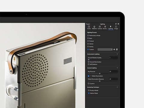
4. Lightroom Presets
Over years of visual development and experimentation, we've built a library of custom Lightroom presets that serve as the foundation for our editing workflow. These presets reflect our evolving style and provide a consistent visual baseline across different projects.
Each preset is designed to bring out key elements in our renders—whether it's enhancing natural lighting, balancing colour temperatures, or emphasizing material details. By applying a preset early in the editing process, we can quickly establish a cohesive look and feel, save time on repetitive adjustments, and focus on fine-tuning rather than rebuilding edits from scratch.
While no preset is a one-click solution, they give us a strong head start. From there, we adapt the settings based on the lighting, materiality, and composition of each render.
This approach helps ensure our images not only look polished, but also remain true to the intent and realism of the original 3D scene.
5. Lightroom Sections
Lightroom gives us powerful tools to refine and enhance our renders beyond what’s possible in KeyShot. Here's how we typically approach each key section:
5.1. Tone
This is where we start. The Basic panel controls the overall tone of the image—exposure, contrast, highlights, shadows, whites, and blacks. These adjustments help bring balance to the image, ensuring whites aren’t blown out and blacks don’t band or lose detail.
5.2. Texture & Clarity
We use Texture and Clarity to subtly enhance surface detail and edge definition without making the render look over-processed. These controls are especially helpful for bringing out material qualities like wood grain or brushed metal. In some cases, we may even decrease these to reduce structure in the image and create a more filmic appearance.
We rarely use Dehaze as we find we can achieve the same effect through combining other settings above.
5.3. Vibrancy & Saturation
Vibrancy is useful for enhancing muted colours without oversaturating already saturated colours. Saturation gives a global boost to all colours, but we use it carefully to avoid overly stylized results.
Together, they help achieve a more even and intentional colour profile.


5.4. Tone Curve
We tend to leave the Tone Curve untouched in most cases. While powerful, it can create dramatic shifts in contrast and colour that aren’t always suitable for product renders. Maintaining colour accuracy is key for realism and client expectations.

5.5. Colour Mixer
The Colour Mixer is one of our go-to tools for fine-tuning colour. It allows precise adjustments to the Hue, Saturation, and Luminance (HSL) of individual colour ranges. This is essential for correcting colour casts; boosting specific hues without affecting the whole image; bringing visual harmony across different materials and lighting.


5.6. Detail & Sharpening
We use Sharpening and Detail controls to enhance the detail in materials—particularly textures, edges, and surface details. This step is subtle but important for giving the final image a polished, high-quality feel.


5.7. Grain
No image captured on a camera is without noise so we usually always add a small amount of grain to introduce noise into renders. This adds a layer of subtle realism and prevents renders from looking too digitally perfect, especially as we run Denoise in full.
It's a stylistic choice, but one that can bring warmth and depth when used sparingly.


Export
The other huge benefit of using Lightroom is the ability to batch export images. At Visune, we use two export presets - PNG and Web JPEG - which every finished render will be exported in. The PNG will be used when we make ad creatives and social media posts, the JPEG solely for the website.

With Lightoom, we can select an infinite number of images, choose the two presets on the left of the Export panel, and export in one batch. Given our Media Library now contains over 7000 images with dozens added every week, exporting efficiently is crucial for us.
Conclusion
Post-processing isn't about fixing mistakes—it’s about finishing the image with intention. By keeping our KeyShot settings flat and balanced, we give ourselves room to make more precise, creative decisions in Lightroom. This two-part process—rendering and editing—helps us maintain a consistent visual style while giving each project the attention it deserves.
The tools we use are simple, but the key lies in subtlety and consistency. With the right presets, targeted adjustments, and a clear eye for tone and detail, even small edits can make a big impact.

To help others achieve the same results, we don’t just provide the finished KeyShot and Blender scenes, we also include the Lightroom presets used to export the final listing images, so even if you're new to post-production, you can match our style with a few clicks. Visit our Instruction Manual to learn more about how to use our presets.